New look, same passion
Meet our new look
The time for change has come. We want it to be clear at a glance what we are creating at Authentica. We are no longer just making displays like we were in the beginning. Over the past 21 years we have successfully grown into several segments and we are now uniting all of this under one strong identity. Our new visual identity clearly shows who we are and reflects our passion for innovation and commitment to creating extraordinary experiences.
We pride ourselves on the fact that our services are comprehensive - from store design to logistics outsourcing. We stand on four pillars that come together under one roof - our company Authentica. The new visual identity has given us a strong logo, common to all divisions.

Together under one roof
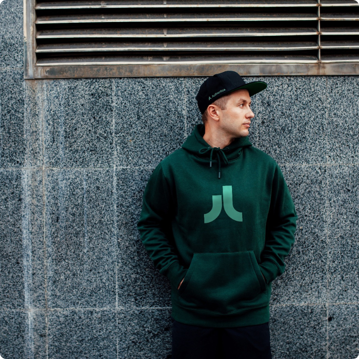
The symbol of the logo is the letter A, transformed into two lines that represent upward movement. Taking experiences to a new level - Elevating Experiences. The lines in the logo also symbolize the confluence of several processes, the way our divisions and individual teams work together and support each other. They also look like a winning high-five, the successful completion of a process or job.
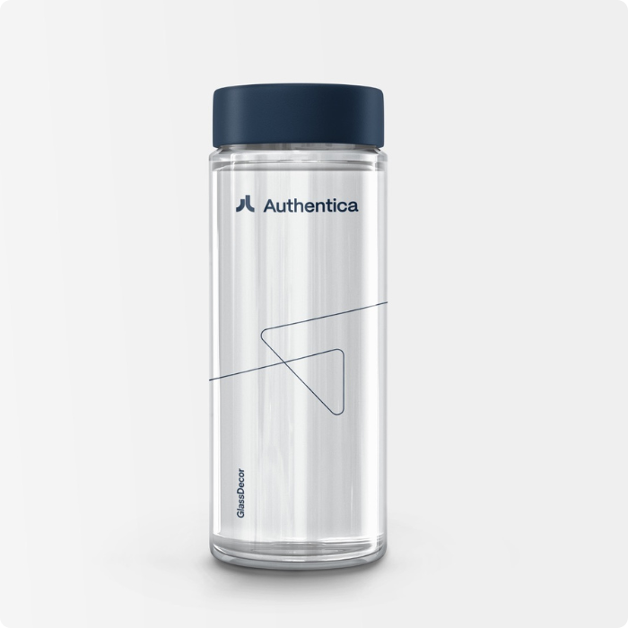
The different divisions are distinguished from each other by a colour scheme unique to each of them. DesignSpaces, a division focused on retail space design, was given a subtle shade of beige. Colours associated with elegance and luxury. BrandActivations, the division that focuses on the development and production of POS and in-store systems, was given a vibrant green. The blue colour, typical of glass, is associated with the GlassDecor division dedicated to decorating and printing primary packaging. Fulfillment is recognisable thanks to the distinctive orange associated with logistics. This division provides its customers with a complex outsourcing service.

Every journey is unique
The symbolism of the journey has been carried over from the logo to the presentation of the individual divisions. They are not only represented by their colour, but also by the line around their logo, which underlines the character of each division. The soft, elegant line can be found in DesignSpaces, the full force in BrandActivations, the sharp-edged line of cut glass in GlassDecor and the path of the robot riding in the warehouse in the Fulfillment division. All the lines always have a growing character symbolizing the elevation of experiences and the acceleration of brand growth.
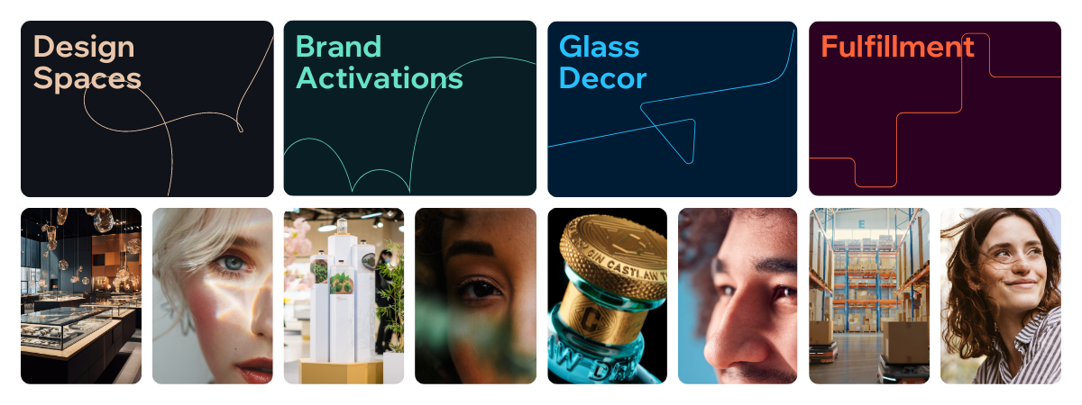
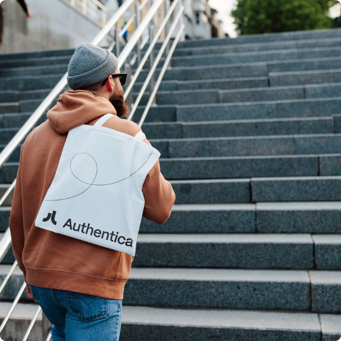
The advertising materials of the individual divisions are complemented by product and image photos in a modular layout. They help to complete the atmosphere we create with our services. We want to bring brands right in front of customers' eyes and create an extraordinary shopping experience.
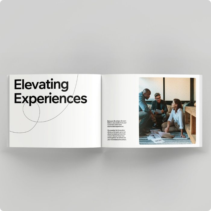
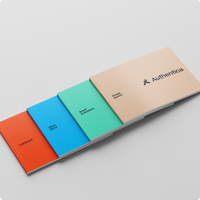
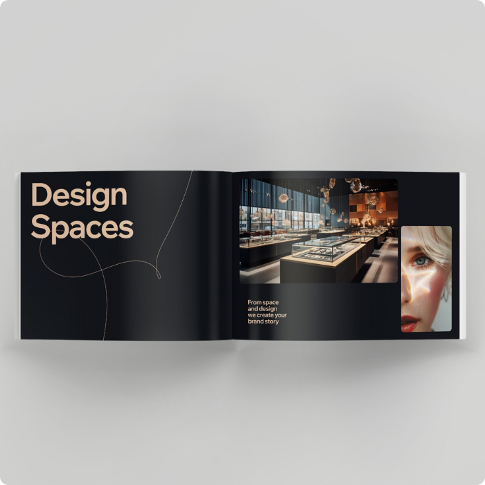
The new identity from creative studio B tým gave us the opportunity to make our services clearer. It shows that thanks to our broad specialization, our customers can satisfy their needs with one supplier under one roof. But it also shows that even a Czech brand based outside the capital has ambitions to become a global player.
New website
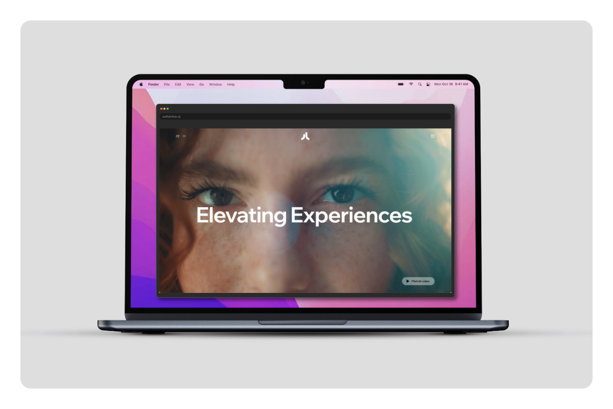
You can also look forward to a new website, which we are working on intensively. And we can't wait to introduce it to you. Follow us on social media so you don't miss a thing.
10. 10. 2024, Lucie Kadlecová