Tam, kde byli na začátku 4 lidé a spousta snů, dnes maká více jak 250 odborníků, specialistů a kreativců, kteří jsou připraveni pracovat na vašich projektech.
Tvoříme budoucnost nákupu propojováním online a offline světů
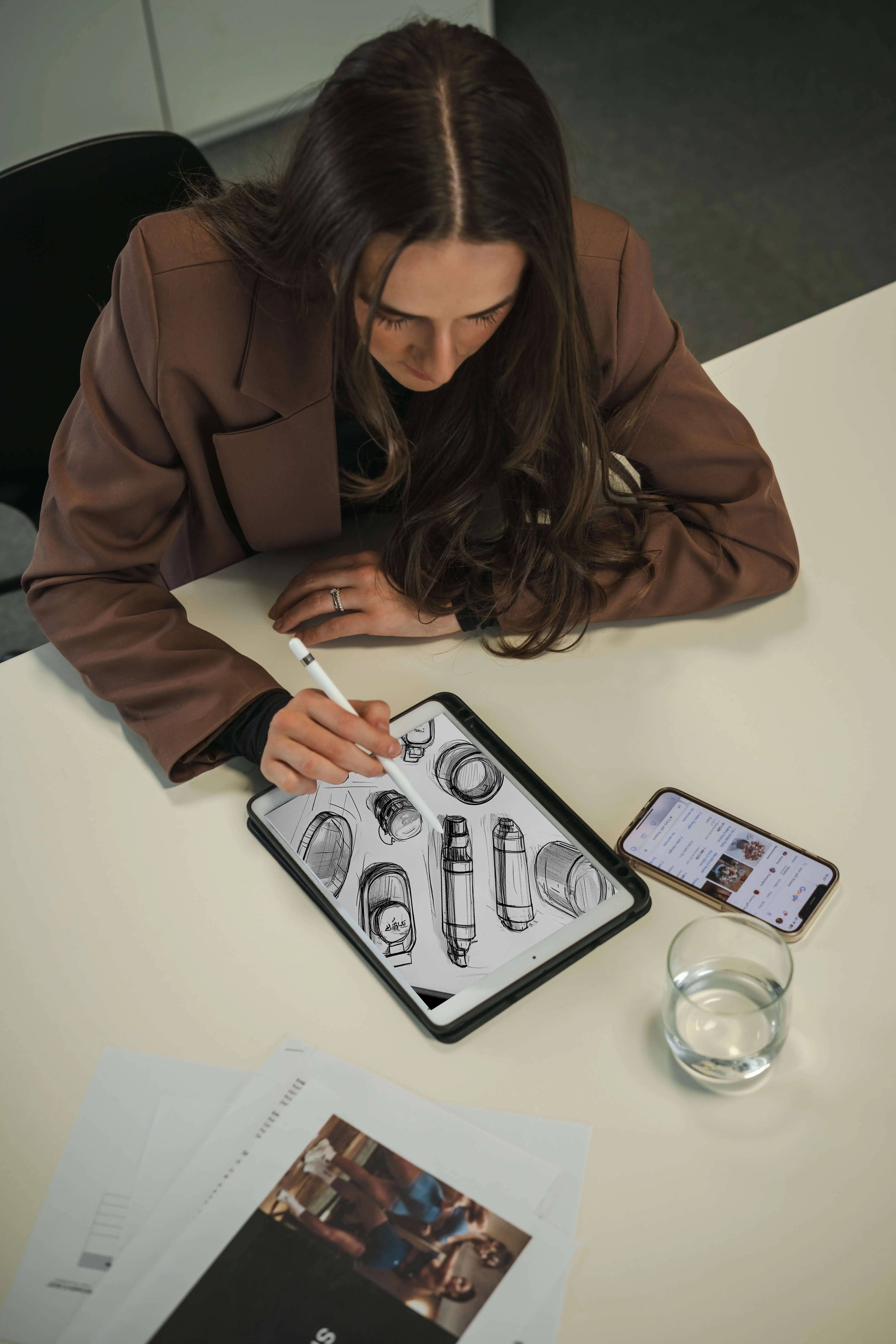
Díky inovacím v product & store designu a logistice přinášíme značky přímo před oči zákazníků. Naše řešení vytvářejí nezapomenutelné nákupní zážitky a posouvají značky nad konkurenci.
Vše pod jednou střechou – od designu po logistiku
Jsme komplexní partner, který propojuje kreativitu, výrobu a logistiku do jednoho bezchybného celku. Šetříme váš čas i náklady a přinášíme výsledky, které mají skutečný dopad.
Tam, kde byli na začátku 4 lidé a spousta snů, dnes maká více jak 250 odborníků, specialistů a kreativců, kteří jsou připraveni pracovat na vašich projektech.
Tvoříme budoucnost nákupu propojováním online a offline světů
Díky inovacím v product & store designu a logistice přinášíme značky přímo před oči zákazníků. Naše řešení vytvářejí nezapomenutelné nákupní zážitky a posouvají značky nad konkurenci.
Vše pod jednou střechou – od designu po logistiku
Jsme komplexní partner, který propojuje kreativitu, výrobu a logistiku do jednoho bezchybného celku. Šetříme váš čas i náklady a přinášíme výsledky, které mají skutečný dopad.